Walk into any barn and you’ll find colorful jump poles, bright saddle pads, and vivid riding gear. Most of it is chosen with the human eye in mind. But what colors can horses see? The answer is more nuanced than “colorblind” — and it changes how we think about everything from course design to equipment choices.
How horse color vision actually works
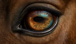
Horses are dichromats — they have two types of color-sensitive photoreceptors (cones) in their retinas, compared to the three types humans have. The two cone types in the equine eye respond to short wavelengths (blue) and medium wavelengths (yellow-green). The visual experience this produces is roughly comparable to what a person with red-green color blindness sees.
This isn’t a deficiency — it’s a calibration. Horses evolved in open grasslands where detecting motion across a wide field mattered far more than distinguishing red berries from green leaves. The visual system that natural selection preserved is one tuned for motion sensitivity and low-light performance, not for fine color discrimination.
What colors do horses see clearly?
Horses see blue and yellow-green clearly. These two wavelength ranges fall within the peak sensitivity of their two cone types, which means horses can distinguish and respond to these colors with reasonable accuracy.
Blue is the color horses perceive most distinctly. In behavioral studies where horses are trained to associate specific colors with food rewards, blue-conditioned horses demonstrate consistent recognition and discrimination. Yellow and yellow-green also register strongly.
Can horses tell red from green?
No — this is the most significant limitation of equine dichromacy. Both red and green fall outside or at the edge of horse cone sensitivity. The visual system interprets both colors through the same medium-wavelength cone, which means they appear as similar grayish or brownish shades.
A horse looking at a red jump pole and a green hedge sees two objects of approximately the same muted, desaturated hue. The contrast that’s immediately obvious to any human rider is essentially invisible to the horse.
Why does this matter for jumping course design?
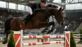
Jump designers often use color contrast to make obstacles more readable — alternating red and white poles, for example, or brightly colored wings. The intention is to clarify the obstacle’s visual boundaries.
But if the contrast is built on red versus green, the horse isn’t receiving the intended signal. Research in equine color vision has led some trainers and course builders to shift toward blue-and-white or yellow-and-black contrasts, which leverage the horse’s actual color sensitivity. These combinations give the horse a perceptible contrast, rather than two colors that look functionally identical.
For a horse approaching a jump at canter, the most important cues are shape, height, and depth — processed through the binocular zone. Color contrast helps, but only if it’s contrast the horse can actually perceive.
Do horses have color preferences for stalls and arenas?
This question comes up frequently in facility design. The short answer: horses don’t show meaningful preferences based on wall color or stall color alone. What does affect perception and behavior is:
- Light-dark contrast between objects and backgrounds — regardless of which specific hues are involved, high contrast makes objects visually salient
- Movement — a colored object that moves is far more arousing than a static one, regardless of color
- Brightness differences — horses are more sensitive to luminance contrast than to chromatic contrast
Blue and yellow-toned elements in the environment are more perceptible to horses than red or green ones, but the practical significance depends heavily on what those elements are doing and where they’re placed.
What does a horse actually see when it looks at you?
Your bright red jacket registers to the horse as a muted brownish shape. Blue jeans or a black helmet are probably more visually distinct. The reflective striping on safety gear catches the horse’s attention more through brightness changes than through its orange or yellow color.
Practical implications:
- Leg position cues are more salient to horses than boot color in training contexts
- High-contrast patterns on protective equipment are more perceptible than color alone
- Arena footing contrasts — white sand versus dark rubber, for example — create visual ground-plane information the horse uses actively
Do horses perceive ultraviolet light?
There is evidence that horses, like several other mammals, may perceive some ultraviolet wavelengths invisible to humans, due to differences in lens filtering between species. The behavioral significance of UV perception in horses is still being studied, but it’s a reminder that the equine visual world has dimensions human observers can’t directly access.
UV-reflective materials — certain white fabrics, some synthetic fibers — may appear differently to horses than they do under human observation, which is worth considering in training environments.
Is color linked to spooking?
Horses don’t spook because of color — they spook because of motion, novelty, contrast, and learned association. A white plastic bag frightening a horse is about the bag’s unexpected movement, rustling sound, and unfamiliar shape — not its whiteness. A “red object” that seems to bother a horse almost certainly has a stronger association tied to texture, sound, or prior experience than to its hue.
Understanding this prevents a common misattribution: assuming that color is the variable when the actual trigger is movement, novelty, or an earlier negative experience with something that happened to be that color.